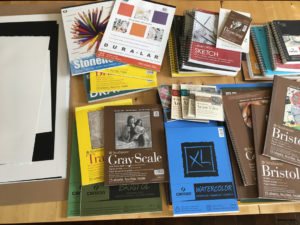
This is the second paper post. If you haven’t read the first one yet, click here and go read it first, this one will make much more sense if read second!
Alright here are my examples of each of the papers I’ve mentioned. I have included the picture and then a super close up scan to show the texture of the paper. Some of these pictures are old, and not the best. I had to go back a bit to find examples of some of the paper types. And I’m a bit better at drawing now, so you know, forgive the badness.
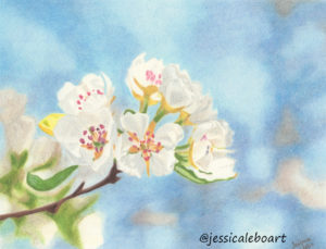
Strathmore Bristol Smooth 300 series
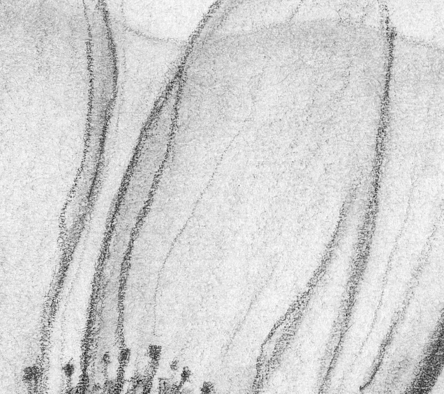
A pretty simple flower drawing. I don’t have a lot of drawings on this paper. It’s a good paper and a lot of people use it, but I would personally pick the vellum for graphite over the smooth. But only for the 300 series. This paper is super easy to find locally as they stock it in so many places.

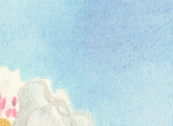
And close up.

Strathmore Bristol Smooth 400 series
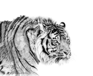
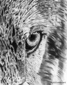
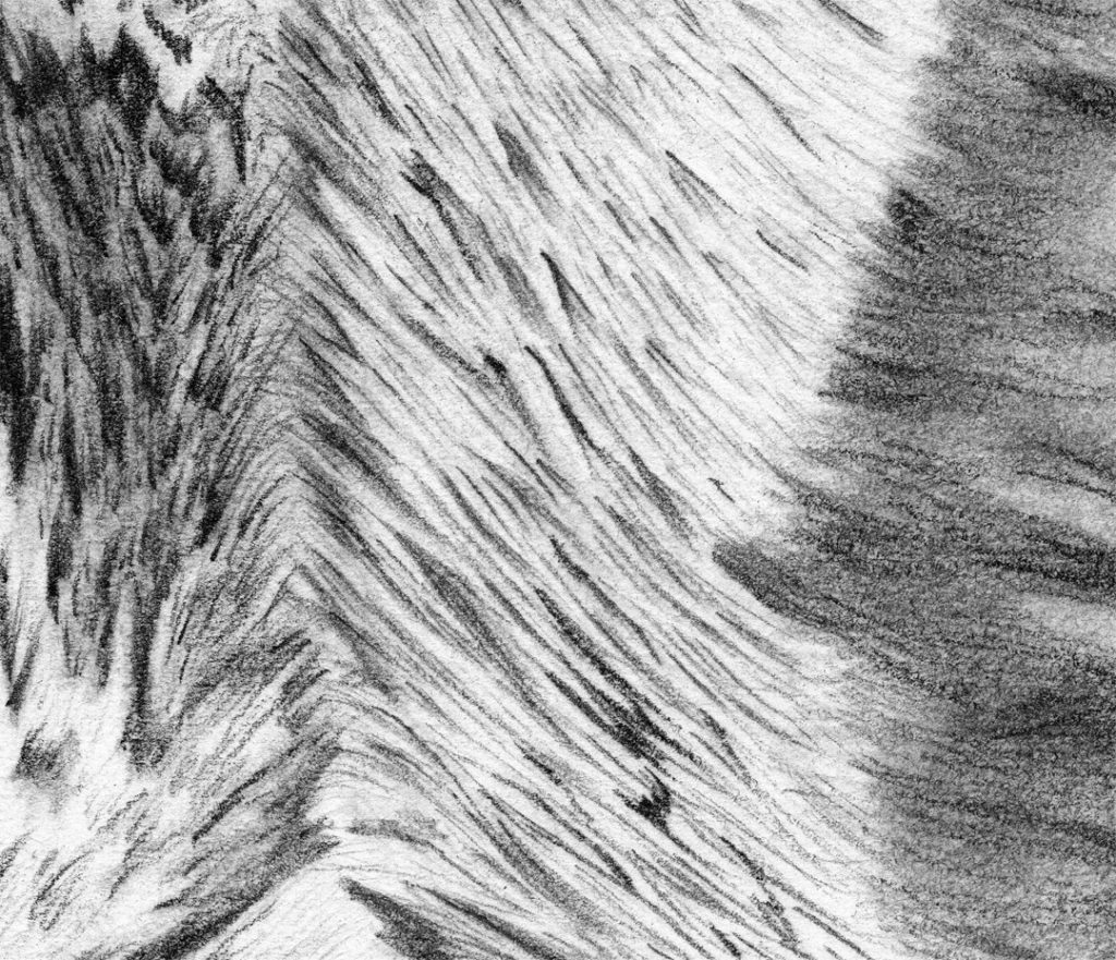
Swoon. I love this paper. I feel like for this paper I could add half of my recent works. I love this paper. Love it. I’ll only put one here, but this is my most used paper recently. Did I mention I love this paper?

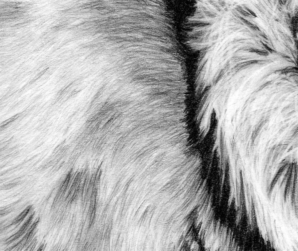
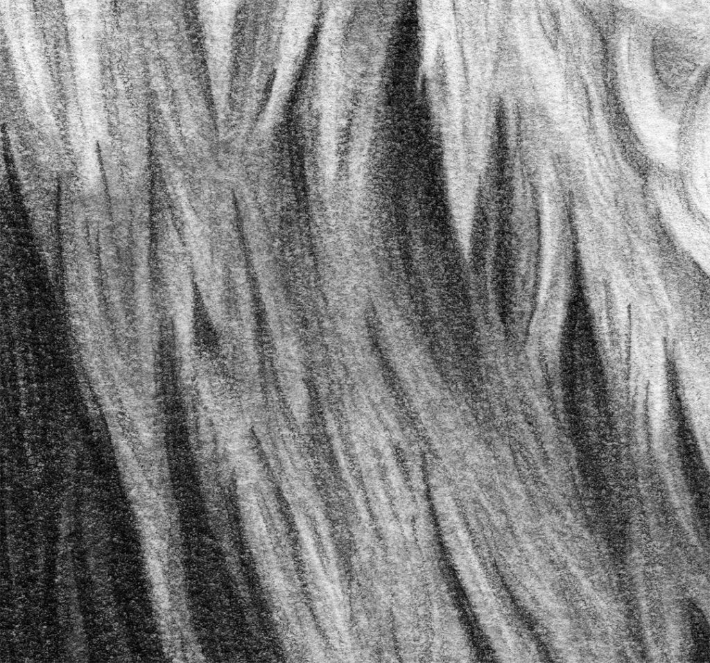
And close up. I can get layers of fur in. And it erases nicely, which helps so much for crazy, messy fur.

Strathmore Bristol Vellum 300 series
A graphite drawing first.

And a super close up. The 300 series vellum has much less texture than the 400 series vellum. I like this paper for graphite. And if I didn’t like the 400 series smooth even more, I would use this one. I have quite a few graphite drawings on it. If I was going to pick from the 300 series only, I’d choose the vellum. It’s actually much closer to the 400 smooth.

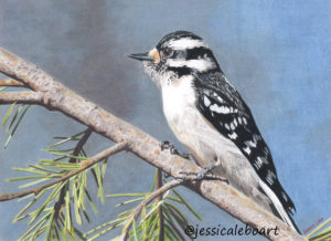
And for colored work this bird turned out not too bad. You can see the background is a bit blotchy from my attempts at using mineral spirits. But overall it’s not terrible. I just wouldn’t use mineral spirits again on larger areas. Which is a common problem for cheaper paper. This isn’t nearly as bad as some papers though in that regard.

This was done with burnishing and it turned out nicely.

And close up, the black reflects some scanning light, so I feel like this one actually looks better in person. You can see that it really is fairly easy to cover the paper, and it doesn’t have too bad of burnishing marks.

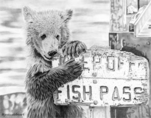
Strathmore Bristol Vellum 400 series
My bear at fish pass. Isn’t he such a cute little guy?!

And close up you can really see the texture of the paper. It’s really a bit too rough for the way I like to work with graphite on animals. It is hard to erase fur highlights. Getting all of the paper filled in takes a lot of effort for dark areas. But the darks do get fairly dark which is a huge plus.

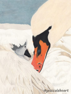
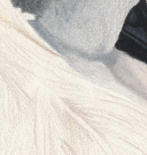
And a colored pencil piece.

And close up you can see that it really took the pencil smoothly. Even with mineral spirits. I would absolutely use this paper again for color. If I ever decide to spice my life up again and dust off the colors!

Strathmore Bristol Plate 500
Haven’t used this paper yet. I do have the outline done though. Big surprise.. it’s a lion. I know, isn’t that shocking?
Strathmore 400 series Drawing
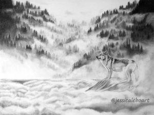
This paper is a bit interesting. It is too thin for a perfect paper, and has a bit of texture. The wolf picture below is a photo, not a scan. Mainly because it’s 18×24 inches, matted (but not framed), and hanging on the wall in my art room, and has been since I finished it which was before my scanner days. It’s one of my favorites. (Even though I’m tempted to redo it because I know I could do a better job nowadays.) But it has an off white tint, and that makes print making a bit interesting.

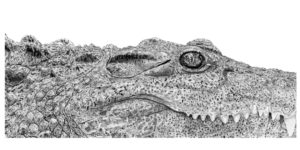
And another favorite drawing that is on this paper.

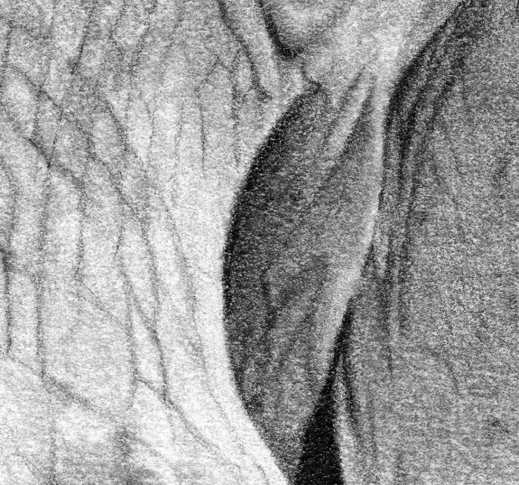
Here is a close up when I’ve taken the paper to a white through editing. The texture was perfect for my crocodile. It helped add so much to the picture naturally.

And here is the original unedited scan. Now keep in mind this is way off from reality. The paper isn’t quite this creamy colored in real life, and the darks are much darker in real life. But I’m throwing this in here to show that it really isn’t white. And does require some additional editing for prints.

Strathmore Colored Pencil
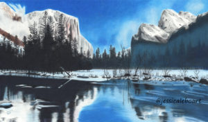
This paper is definitely off white as you can see here.

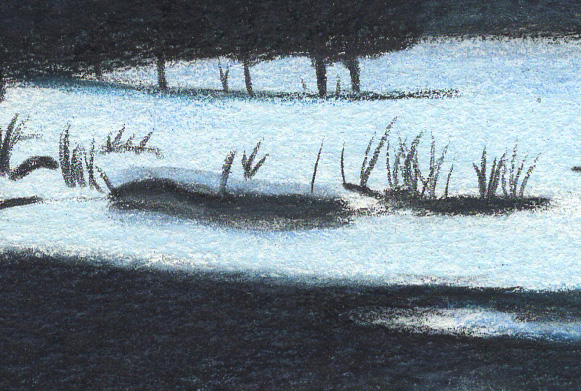
I only got a handful of layers on this paper, but it did work decently with mineral spirits. If it was a heavier paper, maybe it would be an ok choice. You can see from this close up that it does have a bit of tooth.

Strathmore Artagain
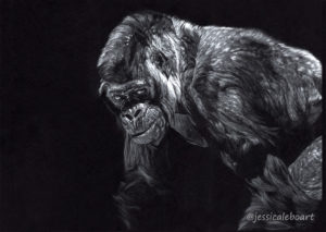
This is another paper I love. I love love it. This is the only black paper I use these days. Although I do have a sheet of another brand. I’ll test it eventually. Who knows maybe it’s even better, I doubt that’s possible though.

And super close up. Ooh this one almost is a bit too close. I feel like he’s sniffing me.

Canson Bristol Smooth
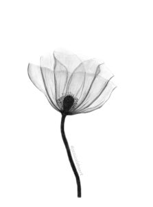
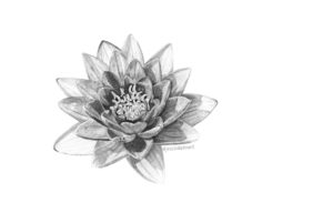
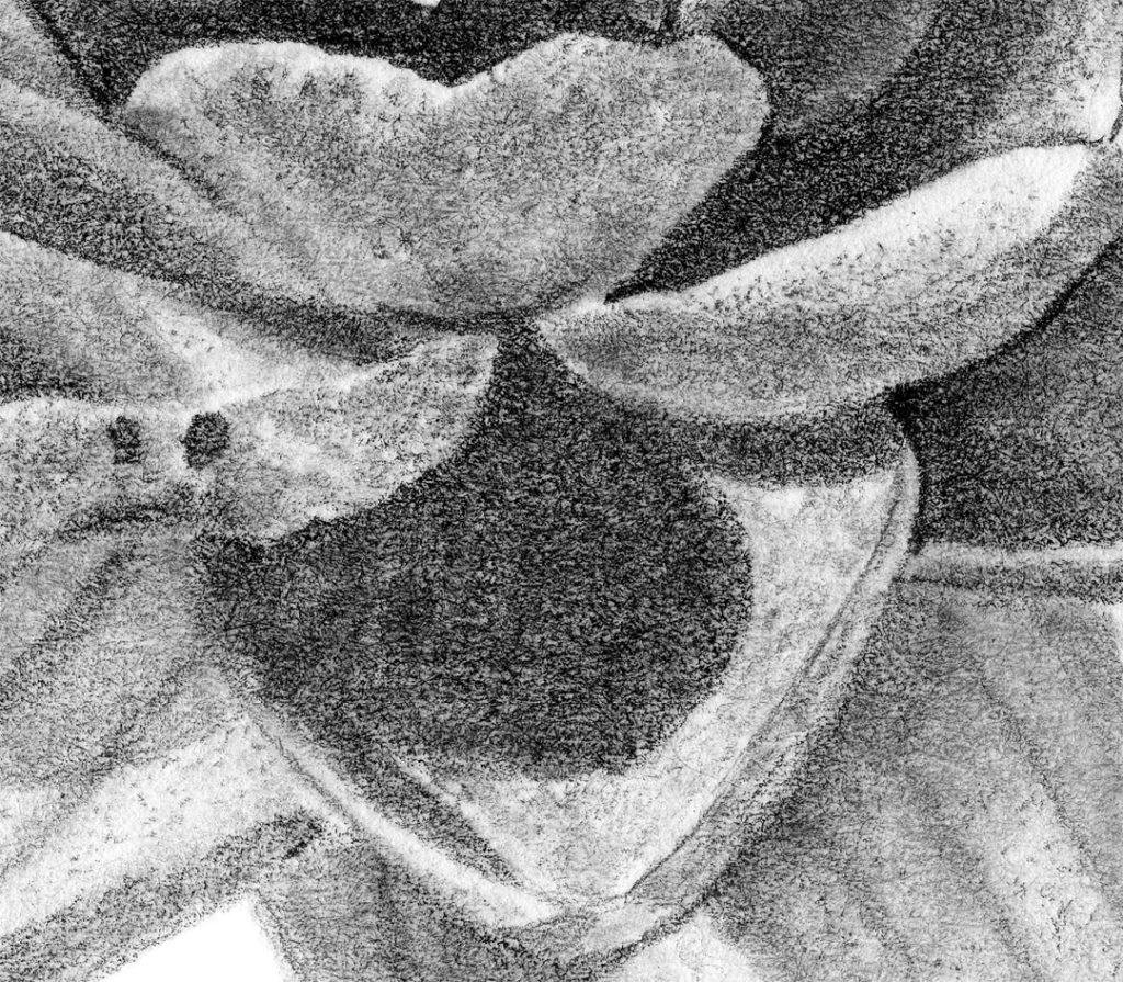
I use this paper mainly for ink, but it works just fine for graphite as well. I personally prefer the Strathmore, but I have no problem using this for smaller pieces like this water lily.

Close up.

Canson Bristol Recycled XL
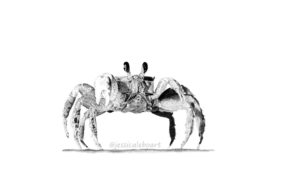
Graphite chimp.

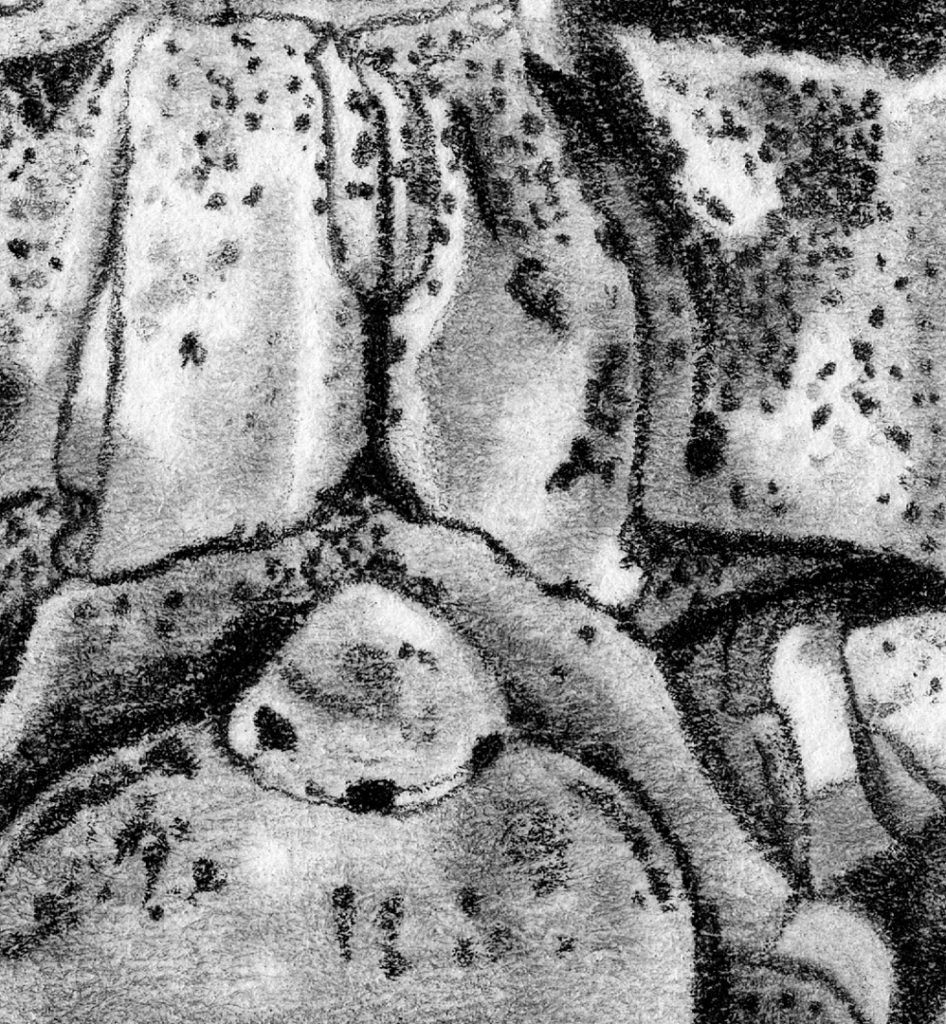
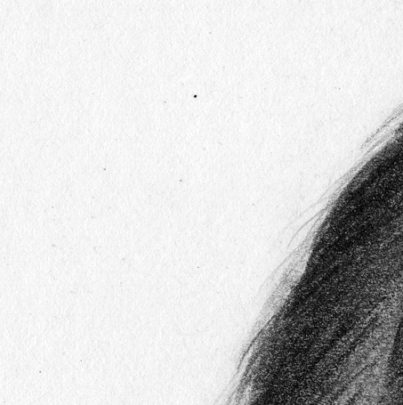
Close up: see all those black specs? They are in the paper, not loose graphite particles.

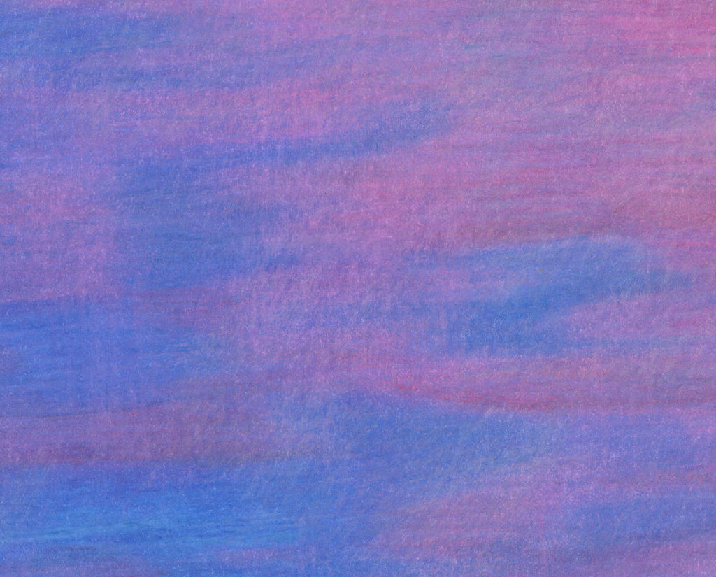
And for colored pencil. This paper is disastrous. Close to nightmarish.

It doesn’t burnish well, and mineral spirits are impossible. Here is a close up of the sky. Just ugh. No matter what it was streaky and blotchy. Doesn’t burnish at all. Just run.

Blick Studio
I’ve used this paper for a couple of graphite drawings. It’s not terrible. Not earth shattering amazing either. It’s a step up from a sketch pad though.
Here is a simple colored pencil drawing. I tried mineral spirits on the blue background, and it didn’t work too well. The paper overall was good for a simple drawing though.


Stonehenge Vellum
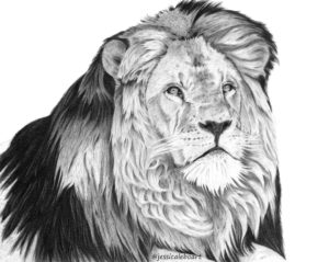
This is a great paper for some things. Bad for others. First this lion. I don’t like rough paper for fur.

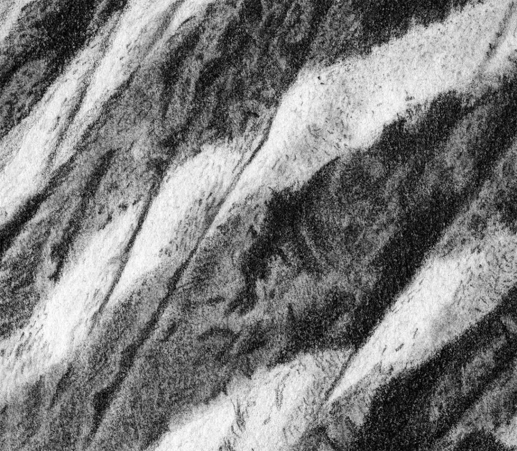
The highlights don’t erase on this paper well at all. It’s just not a great eraser paper for me. You can really see the texture below. Even the black parts of his mane were really hard to get all black because it has just so much texture.

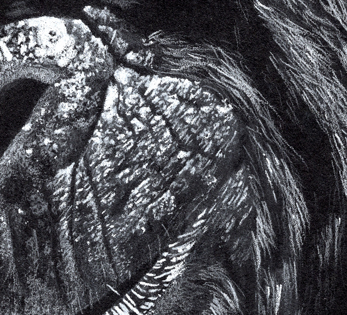
But it’s the perfect paper for this guy. The texture of the paper just adds to his natural wrinkles and makes a perfect combination.

And close up. I love the way this drawing turned out. So this is a paper that I’ll use for no fur or hair, but if they have texture, wrinkles, bumps, perfect!

Stonehenge Sheets
Nothing yet, but I’ll be sure to come back and add photos once I use this.
Arches Hot Pressed Watercolor
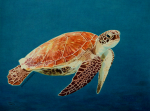
A graphite drawing. Like I’ve mentioned this paper is soft and can snag easily with a sharp point. But it is a wonderful paper in my opinion.

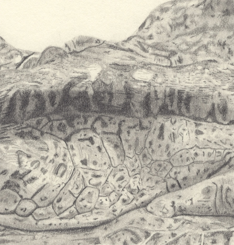
I really tried to get a close up on the sections where I could show the snagging I’m talking about, but even at a super zoomed in scan you can’t see them. The just don’t show up. I think I’ve mentioned I love this paper. I’m actually almost finished with another large drawing on this type, and it is a little harder to get the super detailed layers that I like from the Strathmore Bristol smooth. The paper is just softer, and therefore lends to a bit of a softer overall drawing instead of super sharp and crisp fur. It’s not a bad thing, you just have to realize it going in. I’ll probably come back and add a close up of it here when I’m finished to demonstrate what I’m talking about.

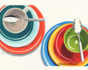
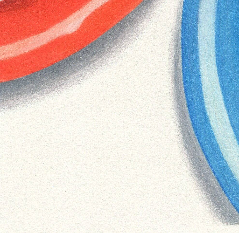
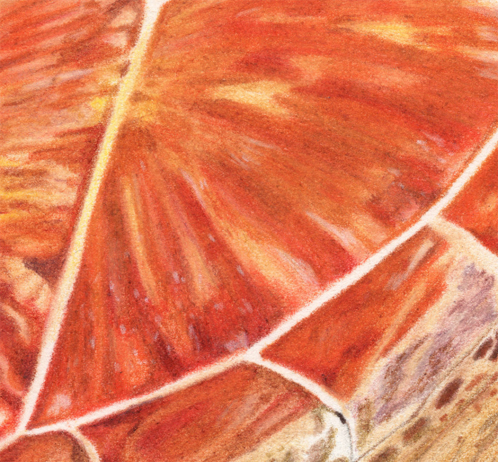
And a colored pencil drawing. The background on this picture is a bit of a disaster. But that is completely user error. I had no idea I would actually end up liking this picture. So I drew it with the watermark of the paper taking up the entire bottom right corner. Then I had to make it darker to cover it, then I tried to make it blend with the rest of the paper, and I was way too many hours and layers in give up. But I learned a lesson: don’t draw on a watermark. They can’t be covered up easily and smoothly. The colors will blotch up and you’ll spend hours making a mess and attempting to clean it up. Why do they even make them so huge anyway?!

Close up. The turtle part looks not too bad at least.

Fabriano Artistico Hot Pressed Watercolor
This paper is alright for me. I would use it if it was laying around, but wouldn’t go out of my way to buy it again. It doesn’t erase as cleanly for fur as I’d like. Certainly not a terrible paper for graphite though.

And close up.

Also an alright paper for colored pencil. A lot of artists really, really love this paper. I personally would rather use Arches, but this paper doesn’t snag like Arches does. So that’s definitely a plus.

And close up. The blending is fairly smooth. It does seem to collect these dots of color for me. Which is very possibly my fault, but I don’t have this issue with other papers, which makes me wonder if maybe it’s not user error.

Canson Mi-Teintes
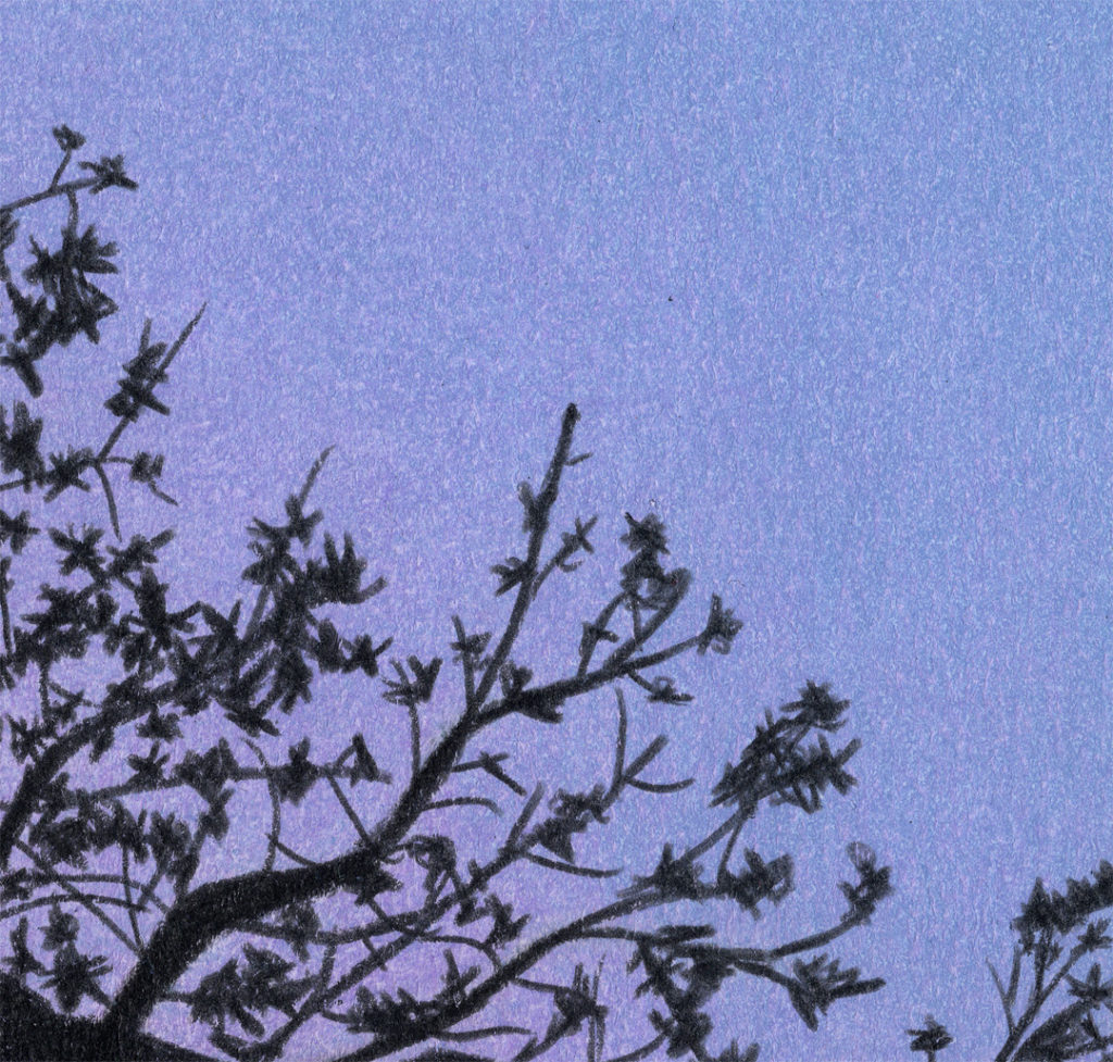
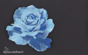
Here’s a white paper drawing on the smooth side.

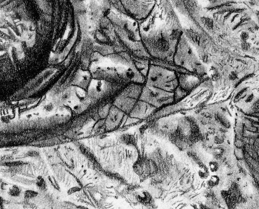
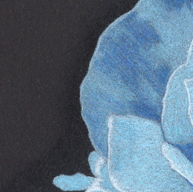
And close up. You can the texture here pretty well. I was using a very sharp black pencil to try and get these twiggy things drawn. Detail just isn’t happening for me on this paper.

And here is the black paper. It doesn’t look too bad from this view.

Close up you can see how much harder it was to cover the whole paper. It’s difficult to get smooth for me.

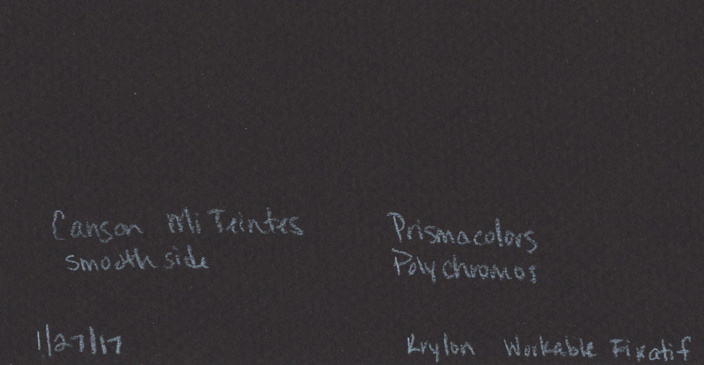
And a scan of the back just to show the rough side. It has a very distinct pattern to it as well. Total side note: this is also how I label my drawings. The date finished, paper type, pencil type, and if I use fixative. I also include where the reference is from and the photographer or user name of the photographer, but they were off to the other side.

And that folks is the conclusion for now. I’ll update it as I continue to add to my experiences. Please let me know what your favorites are! Have I completely missed yours? Please let me know!
If you’d like to get postcards with my art on them in the mail, sign up below. Find me on social media as well.
SUBSCRIBE
